Creating a distinctive brand identity that honors San Antonio's heritage through the iconic Alamo arch, while establishing a modern, professional presence for the largest volunteer bar association in San Antonio
Logo & Brand Designer
Logo Design
3 Design Rounds
The San Antonio Bar Association (SABA), founded in 1898 and the largest volunteer bar association in San Antonio, needed a new logo design that would reflect both their prestigious legal heritage and their deep connection to the San Antonio community. The logo needed to convey trust, authority, and professionalism while incorporating a meaningful local element that would resonate with members and the broader community.
The design concept centered around incorporating the iconic Alamo arch—a distinctive hump-shaped cap added to the top of the Alamo Church that has become one of San Antonio's most recognizable architectural features. This element serves as a powerful symbol of the city's history and identity, making it the perfect visual metaphor for an organization that represents the legal community's connection to San Antonio.
The goal was to create a versatile logo system that could work across various applications—from letterhead and business cards to digital platforms and signage. The design needed to balance traditional legal aesthetics with modern visual appeal, ensuring it would remain relevant and effective for years to come.
The design process involved three comprehensive rounds of revisions, each building upon client feedback and refining the concept to better capture the essence of the San Antonio Bar Association. This iterative approach ensured that the final logo would not only meet but exceed the client's expectations.
Explored various approaches to incorporating the Alamo arch, testing different typographic treatments and mark designs. Initial concepts ranged from subtle architectural references to more prominent iconographic treatments.
View Presentation PDFRefined the most promising directions based on client feedback, focusing on balance, readability, and the integration of the Alamo arch element. Explored different letterform treatments and mark variations.
View Presentation PDFFine-tuned typography, spacing, and the Alamo arch integration to achieve the perfect balance between heritage and modernity. Developed comprehensive color variations and application guidelines.
View Presentation PDFOne of the key design directions featured a logo mark where the Alamo arch was integrated directly into the letter "A" of "SABA" or "San Antonio Bar Association." This approach created a distinctive, memorable mark that immediately communicates the organization's connection to San Antonio while maintaining professional typography.
In addition to the logo mark variations, we developed several text-based logo options that incorporated the Alamo arch in different ways—as a subtle accent, as part of the typography, or as a supporting element. These variations provided flexibility for different applications and contexts.
Each logo variation was designed to work effectively across a wide range of applications, from formal legal documents to digital platforms, signage, and promotional materials. The variations ensure consistent brand recognition while allowing for appropriate adaptation to different contexts.
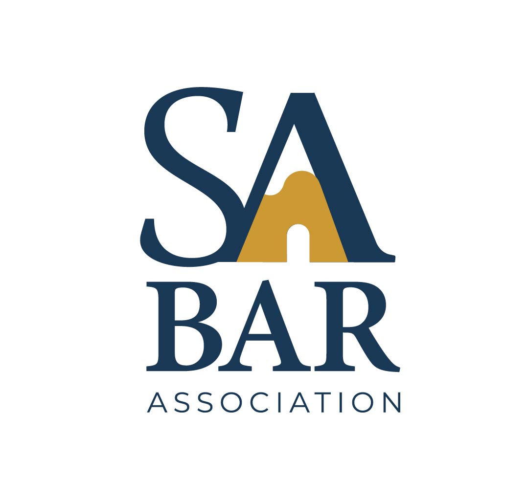
Blue Stacked
Blue Horizontal
Alternative Dispute Resolution
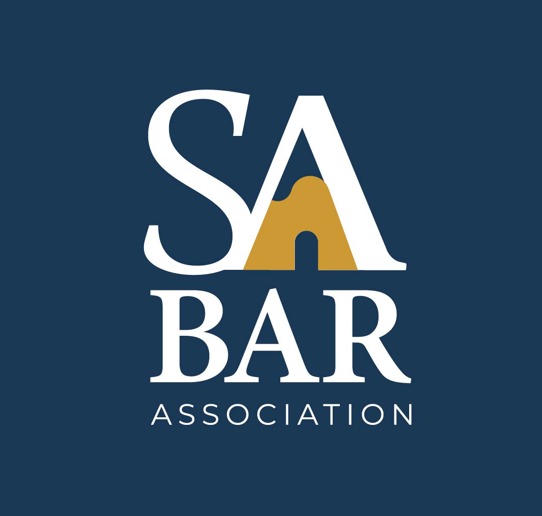
White Stacked
To help the client visualize how the logos would appear in actual use, we created comprehensive mockups showcasing the logos across various applications and contexts. These mockups demonstrated:
Letterhead, business cards, and envelopes showing professional application
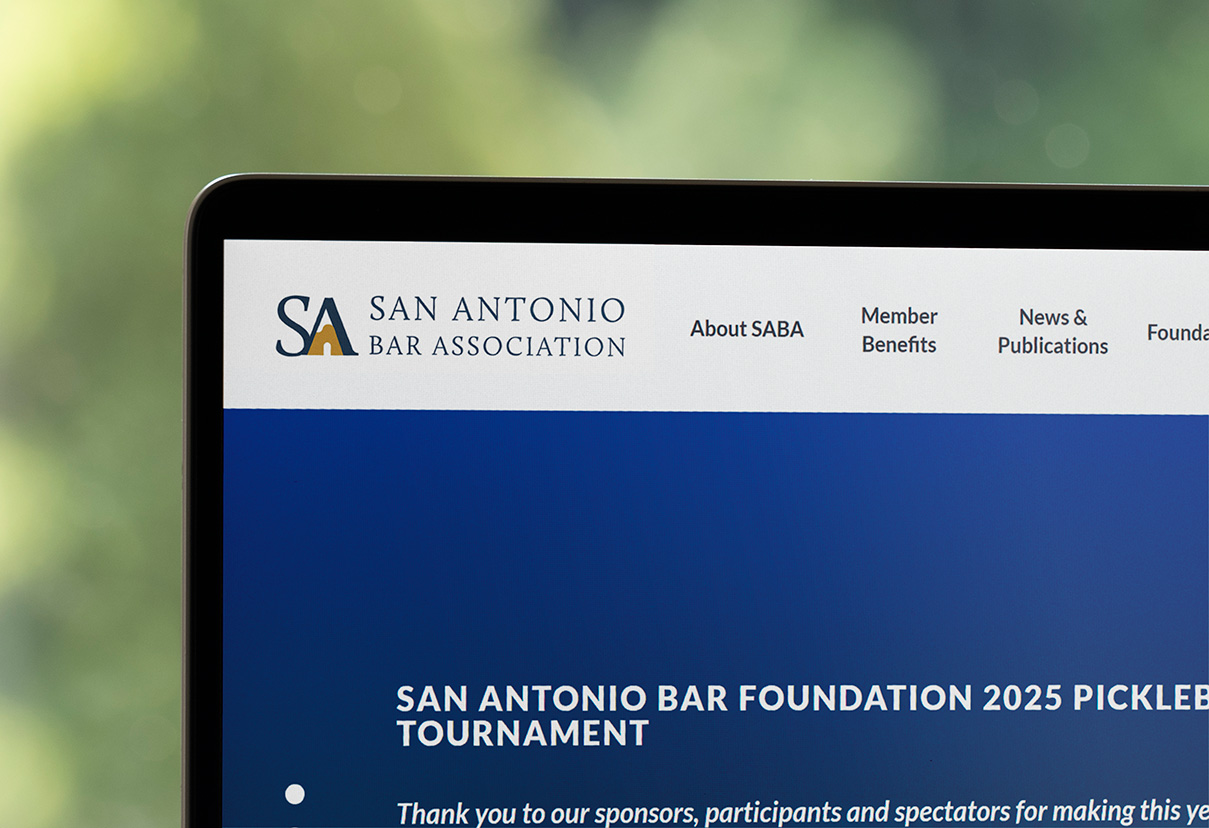
Website headers, email signatures, and social media applications
App icons and mobile interface integration
Conference materials, banners, and event signage
Magazine covers, newsletters, and printed materials
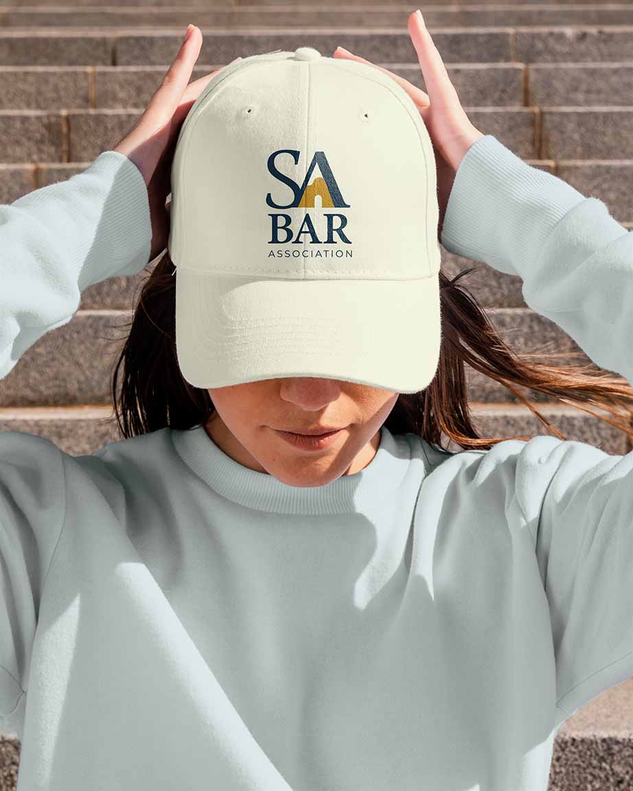
Merchandise, awards, and branded materials
Business Card
Digital Platform
Promotional Items
These mockups were presented to the client as part of the final design presentation, allowing them to see how the logos would function in real-world scenarios. This visual presentation helped facilitate the approval process and ensured that all stakeholders could envision the logo's potential impact.
After three comprehensive iterations and multiple rounds of refinement, the final logos were approved by the San Antonio Bar Association. The approved logo system includes:
The final logo design successfully captures the essence of the San Antonio Bar Association—honoring the organization's prestigious legal heritage while celebrating its deep connection to San Antonio through the iconic Alamo arch. The design balances traditional legal aesthetics with modern visual appeal, creating a brand identity that will serve the organization effectively for years to come.
The iterative design process, comprehensive mockups, and attention to detail throughout the project resulted in a logo system that exceeded the client's expectations. The San Antonio Bar Association now has a distinctive, meaningful brand identity that reflects both their professional standing and their community roots.
Iconic San Antonio landmark incorporated as a distinctive design element
Comprehensive revision process ensuring client satisfaction
Logo marks and text-based options for maximum versatility
Full color, single color, reversed, and monochrome options
Comprehensive visual presentations across multiple contexts
Final logos approved and ready for implementation
Let's design a logo that captures your organization's essence and creates a lasting impression. Whether you need a complete brand identity or a logo refresh, I'd love to help bring your vision to life.